
Paula
Without Paula
2016
A closer look at the work
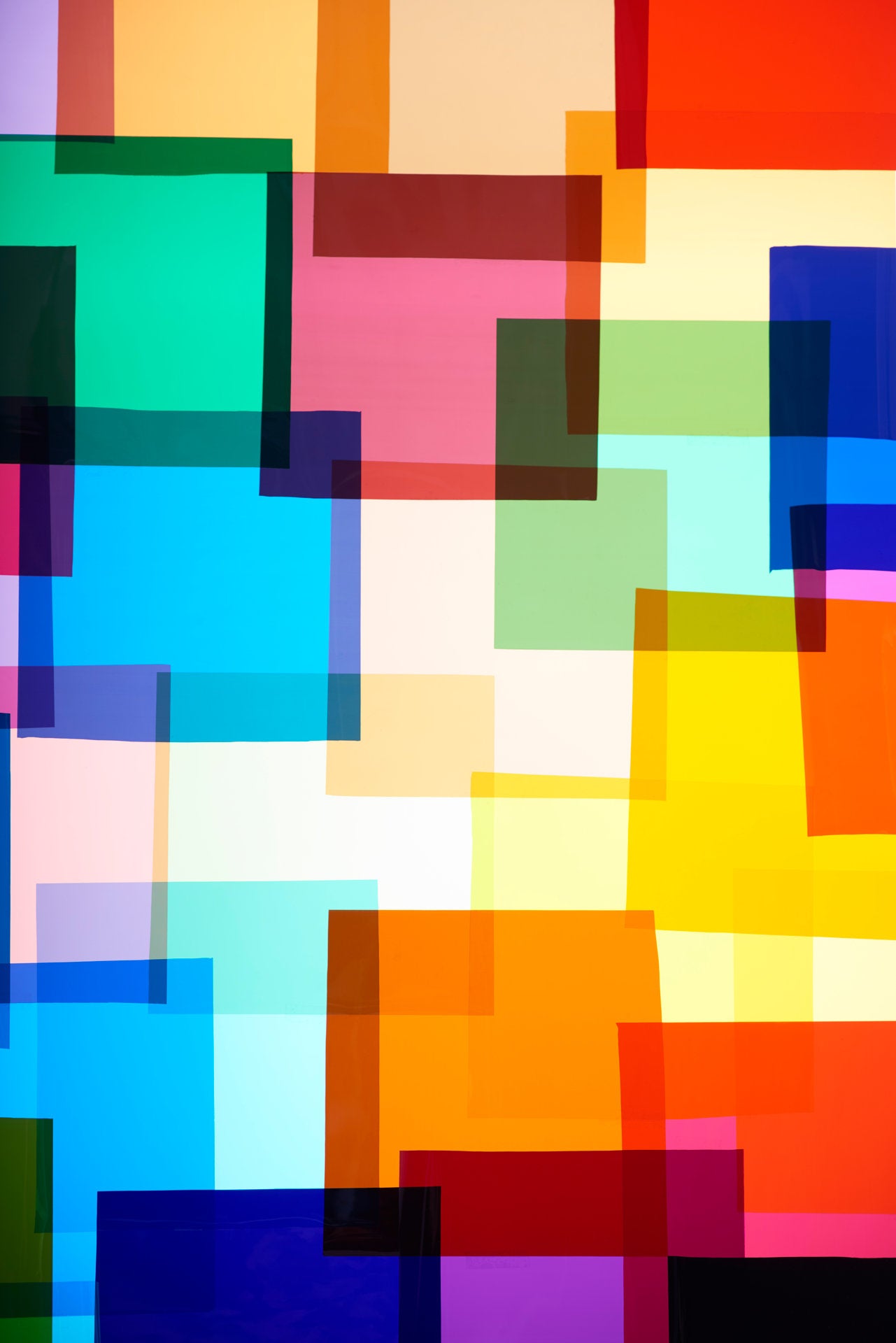
Rectangles of red, yellow, green and blue overlap on a pale ground. Some seem transparent; intersections deepen into dark zones. The vertical frame suggests ascent without prescribing a definitive top or bottom. Broad blocks alternate with thin strips, and white intervals remain as active as saturated colour.
The title names an absence that cannot be located as a gap. What appears is a complete yet open arrangement of planes. It can be read independently while prompting a search for something missing. The tension between name and appearance asks what expectations a title brings to an image of colour and edges.
Size and edition
Variable size · 8 + 2 AP
One shared edition of 8 prints + 2 Artist Proofs (AP) across all sizes. You choose the size; we discuss your preferred dimensions, presentation and framing personally.
The sizes shown are presentation examples, not separate editions. Your preferred size is agreed personally.
Personal consultation
The work, the space, the presentation.
What interests you about this work? I take time for your questions, its origins and its place in a collection. Together, we explore differences between works and their relationship with space, light and architecture.
Size, selected materials and bespoke framing are carefully coordinated. The precise presentation develops through our conversation.
A photograph of the intended space can help us consider scale and placement.
The work in a space
Scale and spatial presence

Visualization · Spatial design proposal. The original photograph is inserted unchanged. All sizes share the same room, viewpoint and scale. Presentation and framing are discussed individually.
Discuss the work
A personal conversation offers time to consider the work, its context and its place in a collection.